Marginal model plots (proposed by Cook and Weisberg 1997 and discussed by Fox and Weisberg 2011) display the marginal relationship between the response and each predictor in a regression model. Marginal model plots display the dependent variable on each vertical axis and each independent variable on a horizontal axis.
There is one marginal model plot for each independent variable and one additional plot that displays the predicted values on the horizontal axis. Each plot contains a scatter plot of the two variables, a smooth fit function for the variables in the plot (labeled "Data"), and a function that displays the predicted values as a function of the horizontal axis variable (labeled "Model"). When the two functions are similar in each of the graphs, there is evidence that the model fits well. When the two functions differ in at least one of the graphs, there is evidence that the model does not fit well.
You can use a SAS autocall macro, %Marginal, to display marginal model plots. You can use this macro to display plots from output data sets after running procedures such as REG, GLM, GLMSELECT, TRANSREG, and so on. The %Marginal macro takes as input an output SAS data set. Options for the smooth fit function include loess (the default), penalized B-spline, and polynomial regression.
%let vars =  nAtBat  nHits  nHome  nRuns  nRBI  nBB  nOuts nAssts
            CrAtBat CrHits CrHome CrRuns CrRbi CrBB;

proc glm noprint data=sashelp.baseball;
   class div;
   model logsalary = div &vars;
   output out=pvals p=p;
quit;

%marginal(independents=&vars, dependent=LogSalary, predicted=p) |
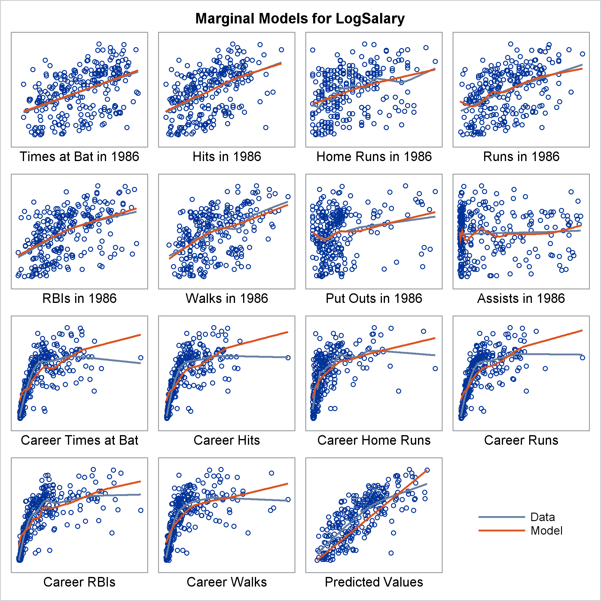
In this example, the two functions correspond well for some independent variables and deviate for others. This is largely because of the outlier, Pete Rose, the career hits leader. Marginal model plots are discussed in more detail in the chapter ODS Graphics Template Modification, Example 22.7 Marginal Model Plots, and the REG procedure, Example 100.1 Modeling Salaries of Major League Baseball Players.
The graph is created by using PROC TEMPLATE and PROC SGRENDER. The rest of this post discusses the macro, template, and graph, not the underlying statistics. You do not need to understand anything about the template to use the %Marginal macro. I want to discuss the template, because I think it contains techniques that are useful in other situations. I needed to use PROC TEMPLATE and PROC SGRENDER (as opposed to PROC SGPLOT, PROC SGPANEL, or PROC SGSCATTER), because there are multiple plots and they do not all use the same plotting statements.
Ignoring for a moment the last cell (the legend), each cell in the marginal model plot displays two functions. Your goal is to compare them and look for lack of fit. The plots are deliberately sparse. Nothing is displayed on the Y axis since all Y axes correspond to the dependent variable. Only the label is displayed on the X axis. Ticks, tick labels, and Y-axis variables would needlessly take up valuable space.
The template has a LAYOUT LATTICE statement that creates a varying number of plots.
layout lattice / columns=&cols rows=&rows
rowdatarange=unionall rowgutter=10 columngutter=10; |
A DATA step sets the macro variables cols and rows. Their values depend on the number of independent variables, n.
%let i = 8,9,10,16,17,18,19,20,21,30,31,32;
select;
   when(n le 2)          do; r = 2; c = 2; end;
   when(n in (3,4))      do; r = 2; c = 3; end;
   when(n in (5,6,7,15)) do; r = 3; c = 3; end;
   when(n in (&i))       do; r = 3; c = 4; end;
   otherwise             do; r = 4; c = 4; end;
end;
call symputx('rows', r);
call symputx('cols', c); |
Procedures such as PROC REG that display residual plots (residuals on the Y axis and independent variables on the X axis) use a similar logic to decide how many plots to display in a panel. The logic is not precisely the same since residual plots typically show ticks and Y axis labels, so they are usually limited to six graphs in each panel. Like some templates that analytical procedures use, the %Marginal model template enables you to "unpack" the plot and display each cell in its own separate graph.
A macro DO loop generates a varying number of dynamic variables that contain the variable names.
dynamic %do i = 1 %to &rows*&cols - &paneled; _ivar&i %end; ncells pplot; |
Another macro DO loop generates a LAYOUT OVERLAY block for each of the first n cells.
%do i = 1 %to &rows * &cols - &paneled; /* ordinary cells */
   if(&i le ncells)
      layout overlay / yaxisopts=(display=none)
                       xaxisopts=(display=(label));
         scatterplot  y=&dependent  x=_ivar&i;
         &smooth.plot y=&dependent  x=_ivar&i / &smoothopts;
         &smooth.plot y=&predicted  x=_ivar&i / &smoothopts
                                                lineattrs=graphfit2;
         %if not &paneled %then %do; /* not paneled?           */
            layout gridded /         /* then put legend inside */
               autoalign=(topright topleft bottomright bottomleft);
               discretelegend 'a' 'b' / location=inside across=1;
            endlayout;
         %end;
      endlayout;
   endif;
%end; |
Procedures such as PROC REG that display panels of residuals use this technique. The procedure writer uses the macro language to generate the LAYOUT OVERLAYs. Each typically varies only because each uses different column names. When you view the template by using PROC TEMPLATE and a SOURCE statement, you do not see the macro code. Many of templates that analytical procedures use are sparser in their original form than you see when you use PROC TEMPLATE and a SOURCE statement.
This is followed by a LAYOUT OVERLAY for the predicted values plot.
if(pplot) /* predicted values plot is handled differently */
   layout overlay / yaxisopts=(display=none)
          xaxisopts=(display=(label) label='Predicted Values');
      scatterplot  y=&dependent  x=&predicted;
      &smooth.plot y=&dependent  x=&predicted / &smoothopts;
      seriesplot   y=_y x=_x / lineattrs=graphfit2;
      %if not &paneled %then %do;
         layout gridded /
                autoalign=(topright topleft bottomright bottomleft);
            discretelegend 'a' 'b' / location=inside across=1;
         endlayout;
      %end;
   endlayout;
endif; |
The final LAYOUT OVERLAY displays only the legend.
layout overlay / yaxisopts=(display=none)
                 xaxisopts=(display=none);
   discretelegend 'a' 'b' / location=inside across=1
                            border=false;
endlayout; |
This might seem like a nonobvious technique. However, a common legend has to go somewhere, and the last cell is a perfect spot for it.
A DATA step generates a macro that contains the names and values of the dynamic variables.
data _null_;
   set __tmpcon(firstobs=&i);
   length l $ 2000;
   retain l 'dynamic';
   if name ne ' ' then /* construct independent var list */
      l = catx(' ', l, '_ivar' || put(_n_, 3. -L), '=', quote(trim(name)));
   if name eq ' ' or _n_ eq (&rows * &cols - &paneled) then do;
      call symputx('pplot', name eq ' '); /* yhat plot in this panel? */
      call symputx('dynamics', l);
      call symputx('i', &i + _n_);
      call symputx('ncells', _n_ - (name = ' '));
      if _error_ then call symputx('abort', 1);
      stop;
   end;
   if _error_ then call symputx('abort', 1);
run; |
PROC SGRENDER makes the graph.
proc sgrender data=__tmpdat template=__marginal; &dynamics ncells=&ncells pplot=&pplot; run; |
The DATA step and PROC SGRENDER step are in a macro DO WHILE loop. When there are more independent variables than can fit in one panel, the macro creates multiple panels. You can see the macro and read more about its options in the documentation sections: %Marginal Macro and %Marginal Macro Options.
The macro reflects a number of my strong opinions about macro writing.
We like to write about PROC SGPLOT in the Graphically Speaking blog. PROC SGPLOT has incredible power, but it can't do everything. That is where PROC TEMPLATE and the Graph Template Language (GTL) come in. GTL enables you to create layouts that contain multiple cells, each of which, can be potentially different.
References
Cook, R. D., and Weisberg, S. (1997). "Graphics for Assessing the Adequacy of Regression Models." Journal of the American Statistical Association 92:490-499.
Fox, J., and Weisberg, S. (2011). An R Companion to Applied Regression. Thousand Oaks, CA: Sage Publications.
